Client
UpSkill Universe
Sector
EdTech
Outcomes
Global Brand Unity
450+ Assets Streamlined
Consultancy-Level Positioning
Can a digital training provider become a global universe of potential?
Yes, by unifying a massive global footprint under a single, portal-driven brand architecture.
The Evolution of a Brand Identity
It’s a challenge many successful businesses face. Five to ten years on from inception, the original brand identity no longer reflects the size, diversity, and potential of the evolved company.
Such was the dilemma facing UpSkill.
The fledgling digital skills training provider had grown into a global organization operating in 34 countries worldwide. Its digital skills learning now stood alongside its Social Impact programs and Diversity and Inclusion training. What’s more, UpSkill’s own people were uncertain as to who and what the company was now.
It needed more than a brand refresh; it required a brand overhaul. It needed a whole new identity that conveyed its common purpose—a universe of limitless potential.
Objectives
BrandStack’s work focused on three main objectives to ensure a successful B2B corporate rebranding:
- Internal Alignment: Developing and diversifying a business invariably leads to internal change and restructuring. UpSkill wanted the new identity to instill a sense of unity and pride among its employees and freelance trainers.
- Market Leadership: UpSkill had already trained around 600,000 individuals and had set a target of one million by the end of 2024. The rebrand needed to reflect the company’s leading position and set the stage for further growth.
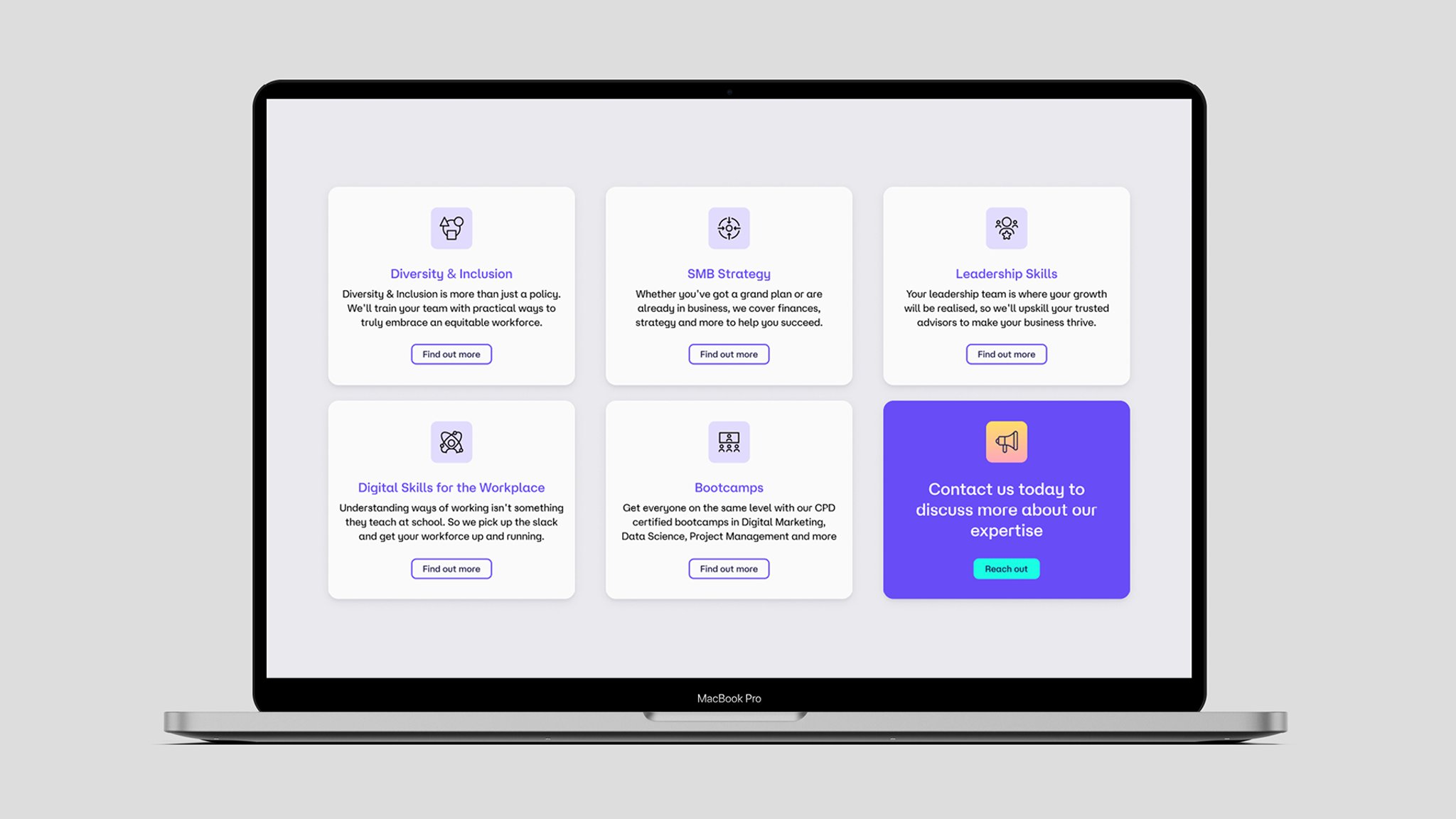
- Service Diversification: No longer just a digital expert, the new identity had to capture the ethos, growth, and diversity of both the new service offering and the wider customer base through B2B technology positioning.
The Challenge
The UpSkill project required much more than just a new logo and color palette; it was a complex technical storytelling challenge.
- Brand Architecture: We needed to create a new brand and name that would encompass who UpSkill had become and unify its three sub-brands under a cohesive B2B rebranding strategy.
- Employee Engagement: We needed to provide employees with a compelling narrative they could believe in, be proud of, and share throughout the wider organization.
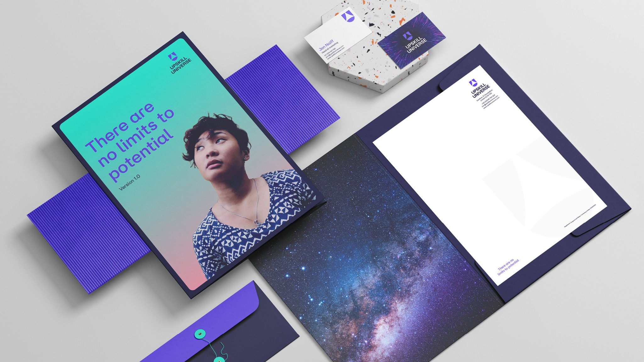
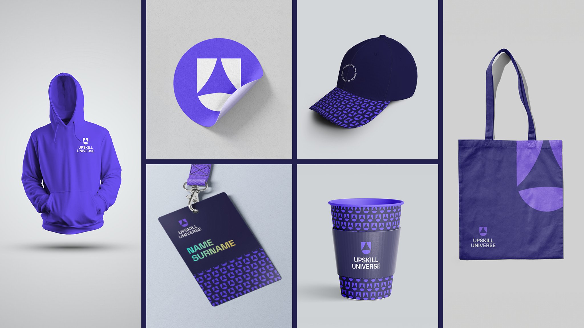
- Transition and Rollout: We needed to streamline the rebranding of over 450 course presentations, trainer documents, handouts, and learner manuals, ensuring a smooth and simple transition—a hallmark of SaaS rebranding best practices.
Name Change: Partway through the project, UpSkill changed its name from UpSkill Digital to UpSkill Universe to better reflect the nature of the business. This change had to be incorporated into the new brand identity.


Approach
We worked with the Head of Marketing and UpSkill CEO and founder Gori Yahaya to explore the brand and agree on a creative direction rooted in B2B rebranding examples of excellence.
- LVB Framework: Our Lovable, Viable, Believable (LVB) framework laid the foundations for the entire rebranding process. LVB helps us create brands that people will love, believe in, and buy into.
- Messaging Workshop: By refining the key brand elements (vision, mission, purpose, value proposition, values, brand personality, tone of voice, and messaging), we pulled out essential phrases to form the base for effective B2B tech company rebranding.
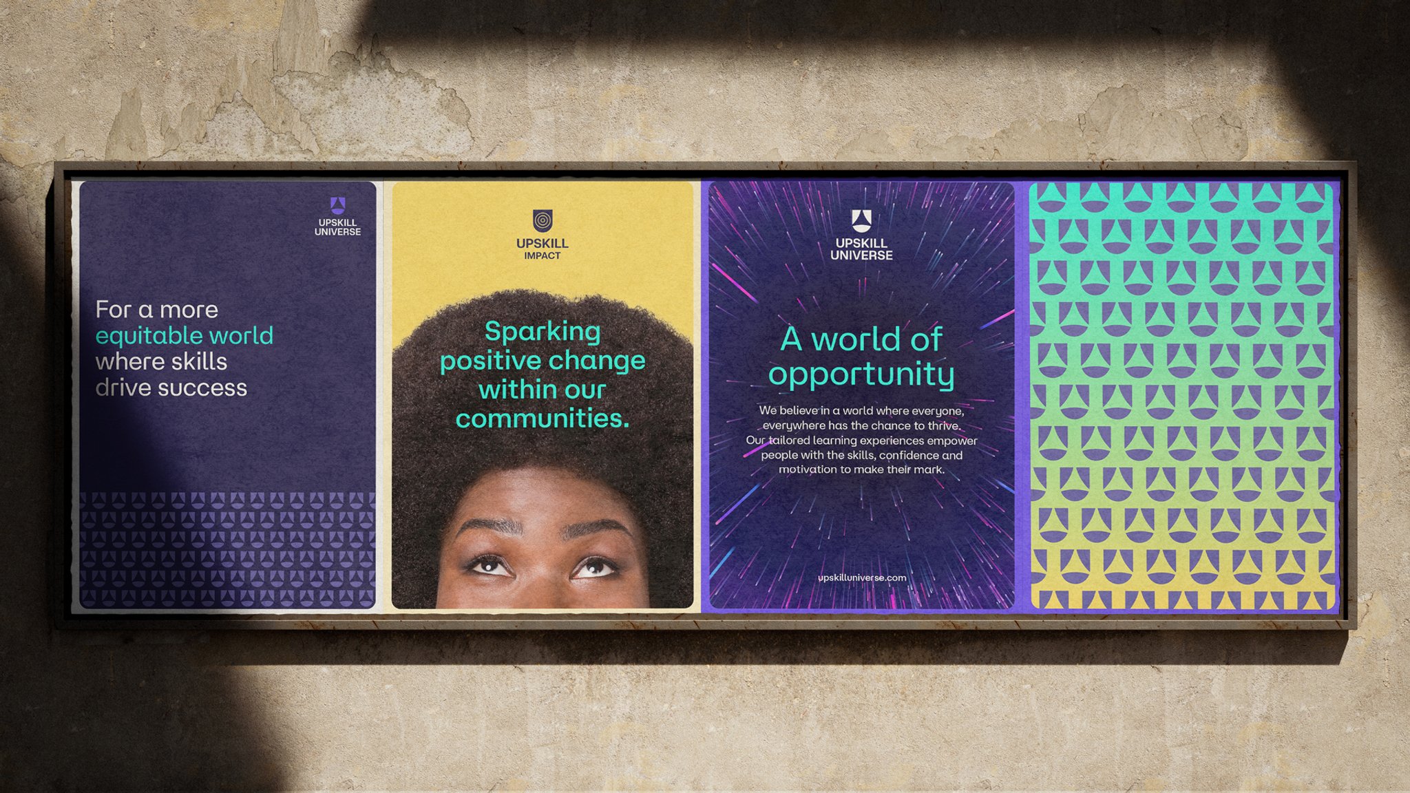
- Stylescapes: To transition from ideas to design, we crafted three distinctive brand identity concepts (Stylescapes) to show how the logo, colors, fonts, typography, messaging, imagery, illustration, and iconography would work in practice. These moved from a ‘mild’ to ‘medium’ to ‘spicy’ slant, demonstrating how a tech company rebranding can evolve into an expected, challenging, or boundary-pushing identity.
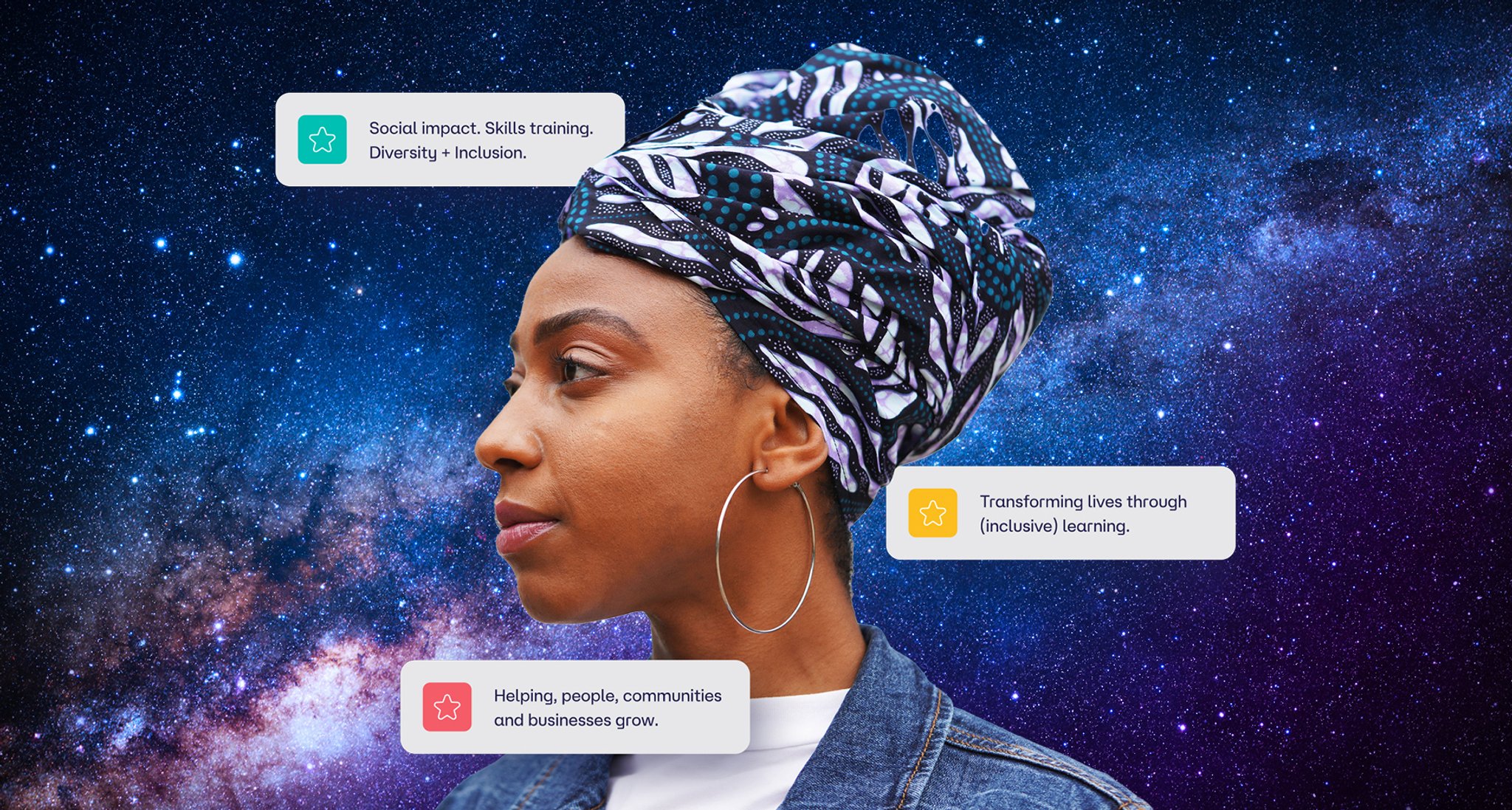
Logo: A major part of the exercise was the creation of a new logo. Determined not to incorporate the overused arrow, we chose instead to show ‘up’ in the complementary imagery: people looking upwards, optimistic images, a guiding star. By starting with a U-shaped window or portal, we created a frame in which to put the arrow, star, and three sub-business verticals.
Deliverables & Outcomes
The six-month project grew from an initial brand redesign into a complete brand overhaul. BrandStack produced a comprehensive portfolio of brand communication assets.
- Design System: The selected Stylescape was refined and transformed into a comprehensive design system. This allowed us to create a framework to guide future design decisions and ensure a consistent brand experience across the B2B website rebranding.
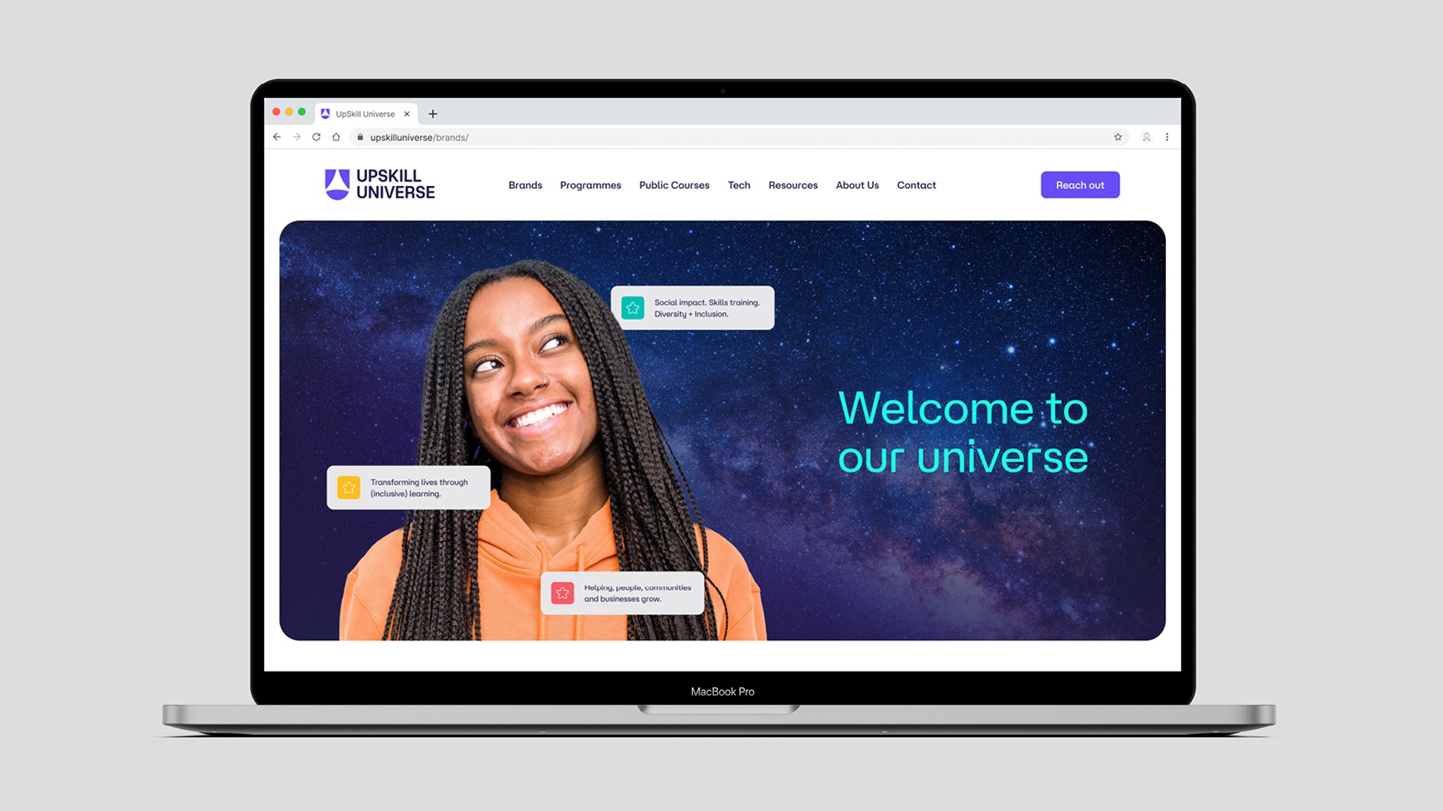
- Sub-brand Identities: Having created the iconography for UpSkill Universe, we designed logos for the three ‘galaxies’ (Inclusion, Workforce, and Impact) to reflect both the Universe family and each skillset’s specialist area.
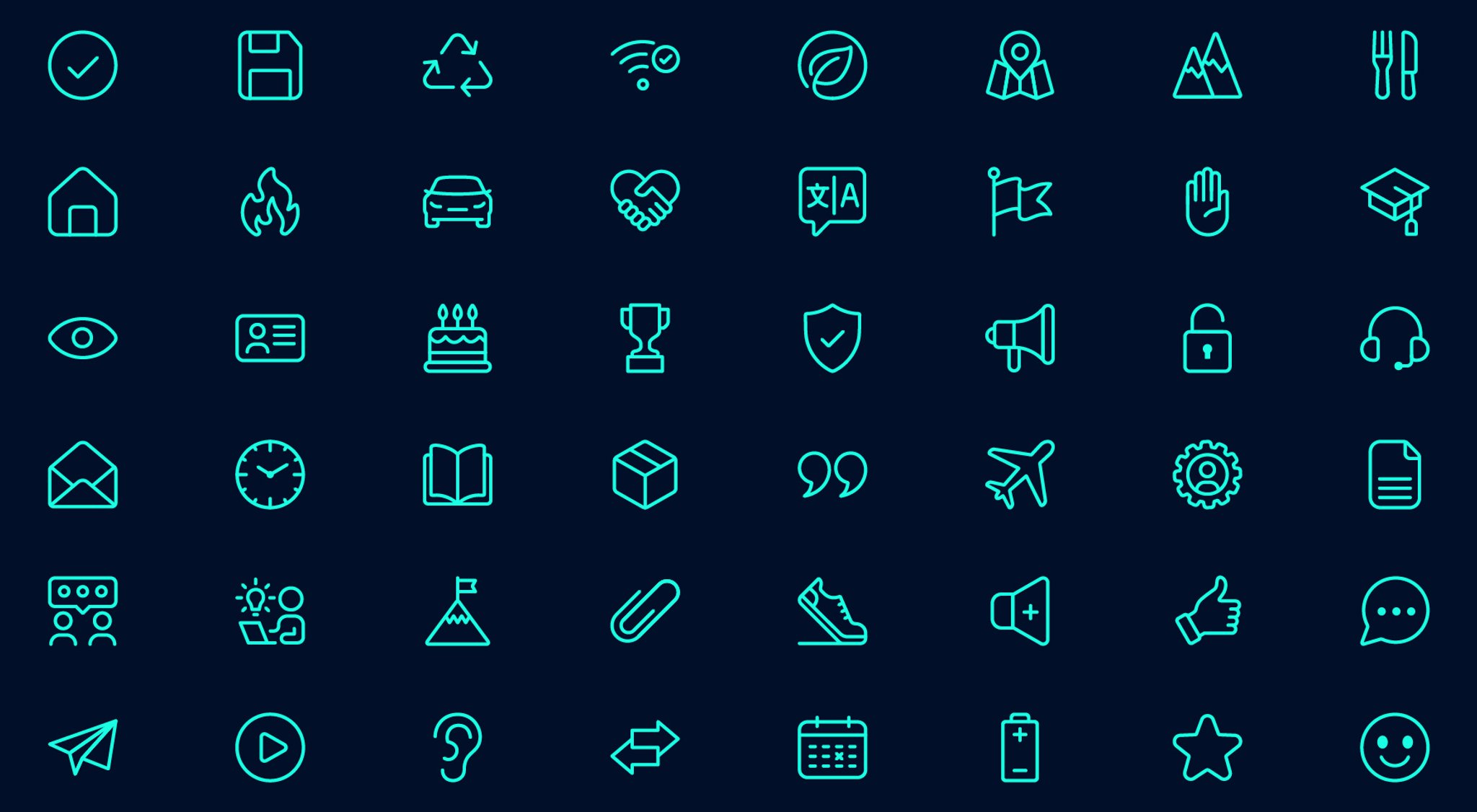
- Bespoke Icons: As using generic icons can damage brand consistency, we created 64 bespoke icons with an identical size, style, and color.
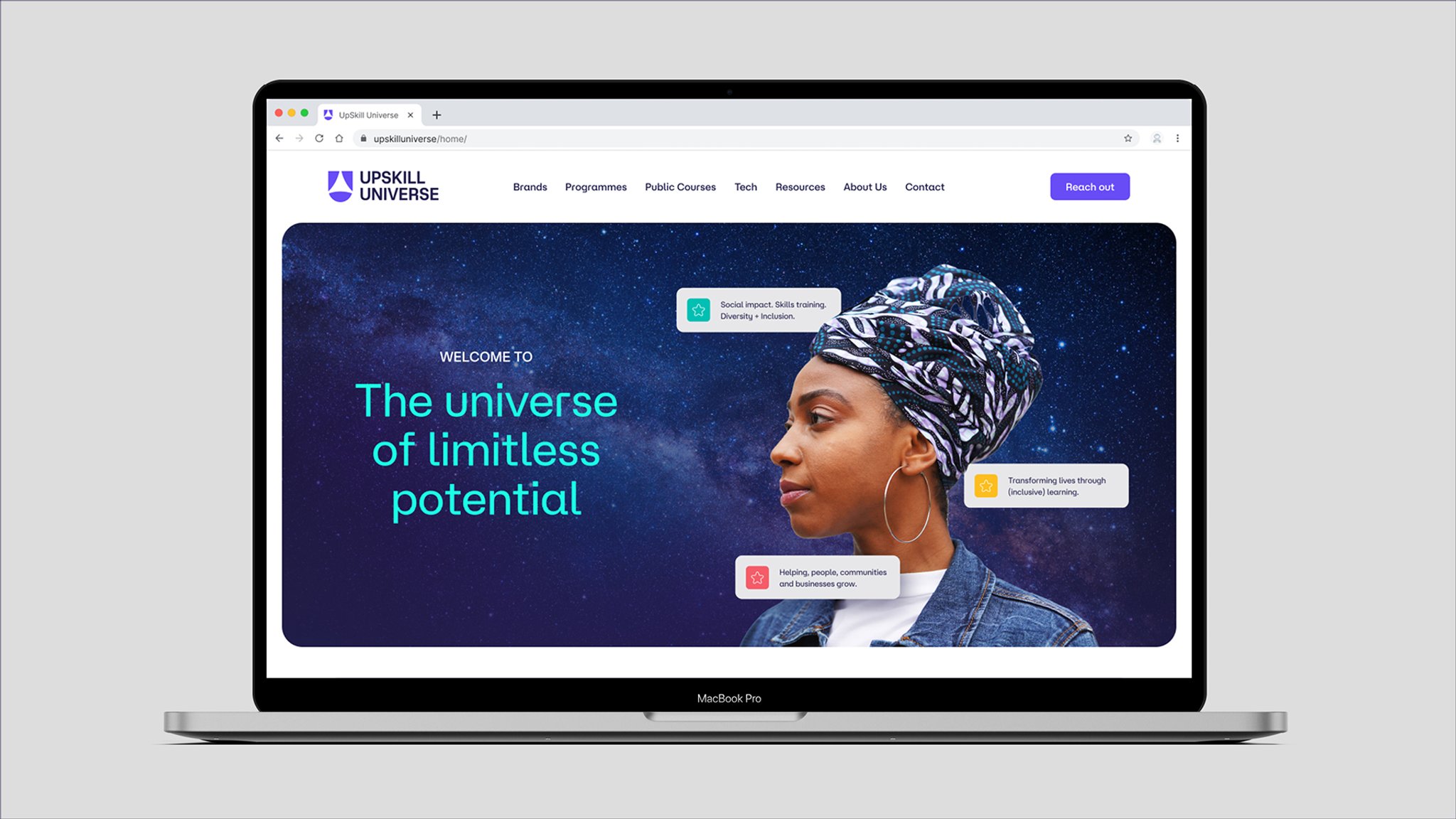
- Website: By creating a style template for various web pages, we were able to provide the web development agency with a modular design tool, following SaaS rebranding best practices.
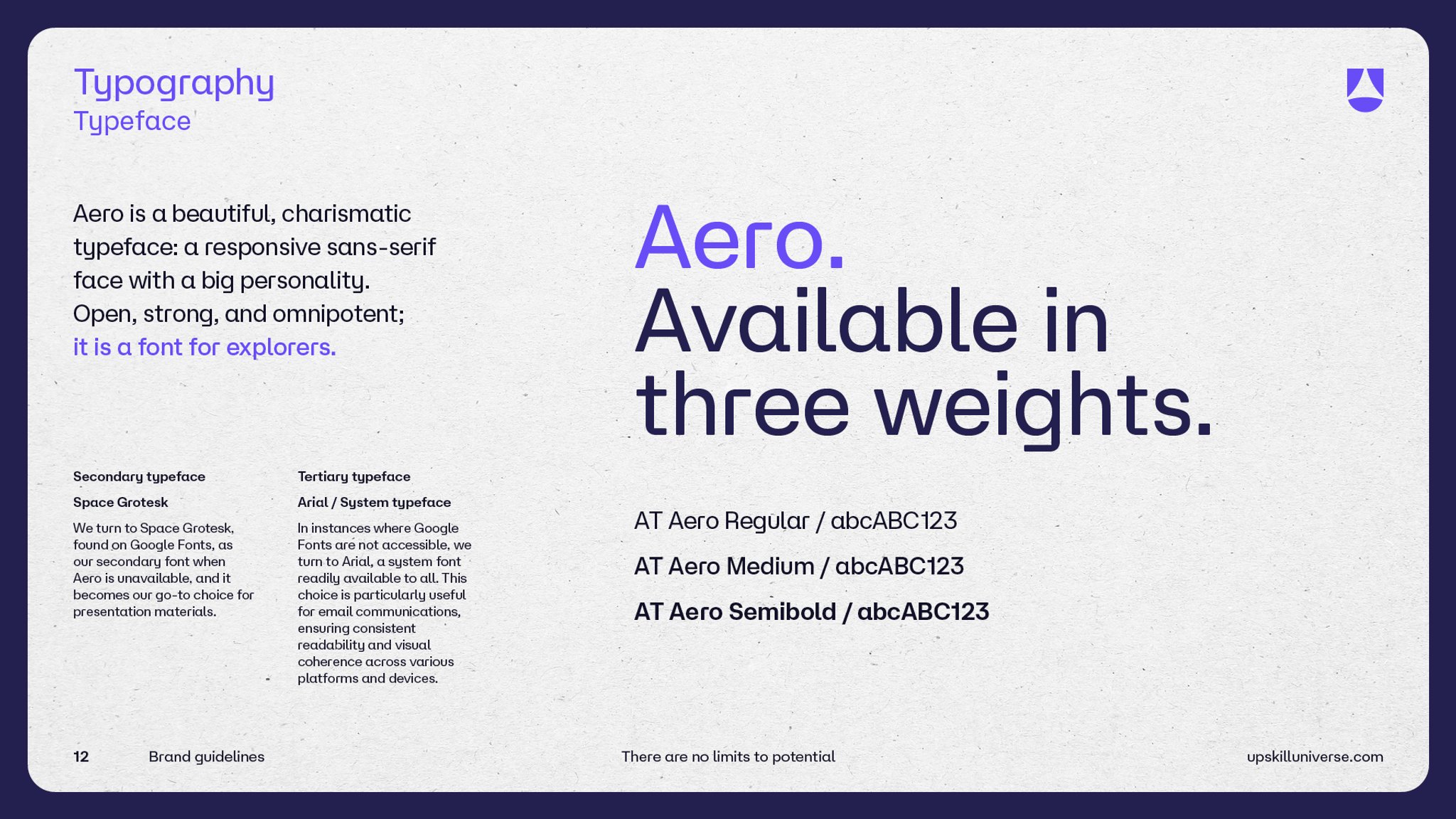
- Brand Guidelines: To ensure the new identity is consistent across all marketing communications platforms, we developed a 32-page rebranding guide outlining how the iconography, typography, color palettes, imagery, and verbal identity should be used.
- Templates: Part of the consistency package was the creation of style templates for PowerPoint, stationery, and social media posts.
A New Chapter for UpSkill Universe
UpSkill Universe now has an aspirational brand identity that positions it firmly within the consultancy services domain. This project stands as one of our top tech company rebranding success stories.
Everything aligns seamlessly with a systematic visual and messaging template that provides a cohesive identity across all touchpoints. A dynamic color palette not only mirrors the group's culture, it also distinguishes the various vertical markets with which they engage.
As the new strapline says, UpSkill Universe welcomes everyone to a universe of limitless potential.
This rebrand is a pivotal moment for us, a celebration of the blood, sweat, and tears the team has poured in over the years and the exciting trajectory our company is on. We are so much more than just a digital skills training provider, and our new brand echoes that.
Gori Yahaya
CEO & Founder