Nobody rebrands just because they fancied a new logo.
In B2B, the decision usually comes later than it should — after a funding round, a pivot, a merger, or the slow dawning realisation that the logo you launched with in 2017 is now actively working against you. But by the time most companies admit they need a rebrand, the brand has already been causing problems for a year.
A rebrand done well closes the gap between who you actually are and how you look and sound to buyers. When a brand is built for a company that no longer exists, every pitch deck, every campaign, every designer who opens the folder and has to improvise becomes a small tax on your business. Over time, those lil taxes add up.
Below are six B2B rebrand case studies that got it right. And not just because they're famous, but because each one solved a different version of the same problem, and because the strategy behind each is actually documented.
Most rebrands come with a press release and a mood board. These ones came with a reason.
Why do B2B companies rebrand?
Before getting into the tech company rebranding case studies, it's worth understanding what actually triggers these decisions — because it's almost never "the logo looks a bit dated." We looked across all six of these B2B rebranding examples and three patterns came up every time.
1. Technical brand debt.
A lot of B2B brands were built for one moment in time: one product, one market, one screen size. When those brands try to scale, they buckle. The logo doesn't work across different platforms. The colour palette behaves differently in print than on screen. The "design system" was never really a system — just a set of files that made sense at the time. Eventually every new asset becomes a headache-inducing negotiation with a system that wasn't built to go this far.
2. Consistency problems.
Buyers notice inconsistency even when they can't name it. If your brand looks one way on LinkedIn, another way in the product, and a third way on a conference stand, there's unnecessary friction. It makes people wonder, maybe not even consciously, whether your product is as polished as your sales deck claims.
3. A business that's moved on.
Companies grow, expand, get acquired, acquire others. The brand that worked for a 20-person startup doesn't always make sense for a 400-person company going after enterprise deals. Sometimes a rebrand is just how you tell the market: we're not that company anymore.
With that context in mind, here's how six companies actually did it.
Six great B2B rebrand examples (and the strategy behind each of them)
1.
Slack rebranded because their logo was impossible to use correctly
When Slack unveiled its new logo in early 2019, the internet had… opinions. One critic called the original a "whimsical swastika." Others pointed out that Pentagram had actually made the mark more complex, which seemed counterintuitive. Both observations were fair, and both missed the actual problem.
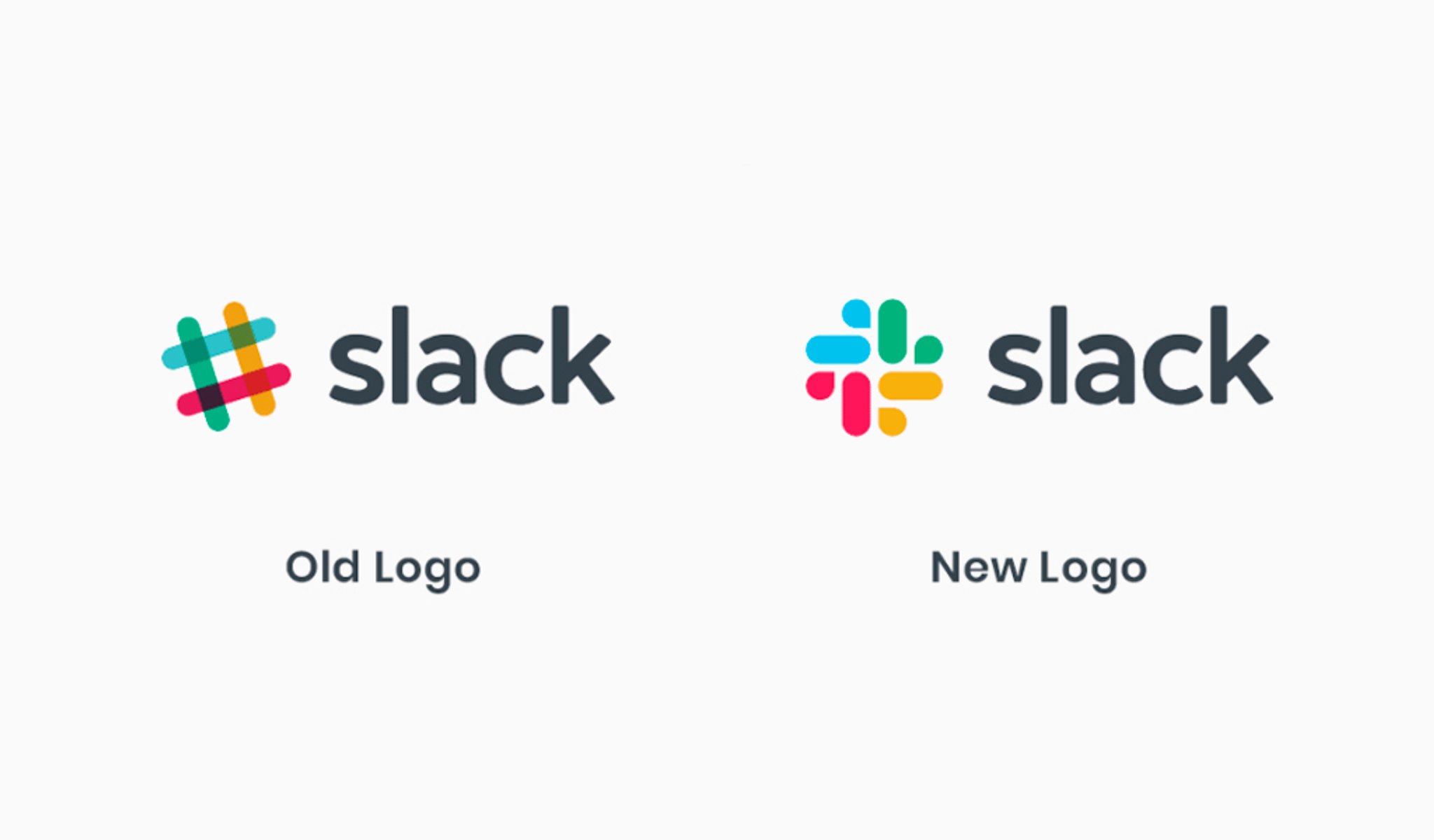
The problem
Slack's original octothorpe (hashtag) logo was charming. It was also, in Slack's own words, "extremely easy to get wrong." Eleven different colours. A rotation that had to be precisely 18 degrees. Put it on any background other than white, or tilt it slightly wrong, and it looked absolutely terrible.
As Slack scaled globally, this became an operational problem more than a design one. The team had ended up with several different versions of the logo for different contexts because the primary one simply didn't work everywhere. As they wrote at the time: "The important thing about being a brand is that whenever people see you in the wild, they should recognise that it's you." That wasn't reliably happening.
What changed
Michael Bierut at Pentagram stripped the palette from 11 colours to four, plus a core "Slack Purple." The overlapping hashtags gave way to a speech bubble and lozenge shape — a mark that worked at any size, on any background, without a specialist to babysit it.
The backlash faded, as it always does. Looking back now, the old logo reads as cluttered and fragile. The new one just works — which was the whole point.
The upshot
A brand is a tool. If your visual identity needs a 50-page manual just for someone to post on LinkedIn, you have a complexity problem. Slack traded a logo people were fond of for one that could actually scale. That's a reasonable trade in our opinion.
Slack's problem was structural — too complex to use consistently. Brex's was different: the brand was fine, it just belonged to an earlier version of the company…
2.
Brex rebranded to close a trust gap their sales team was tired of bridging
Brex launched as the credit card for startups. Smart, specific, easy to explain. By 2020, it had become a cage. Brex was building a full financial stack for enterprise companies, and a brand built for YC Demo Day wasn't helping them have those conversations.
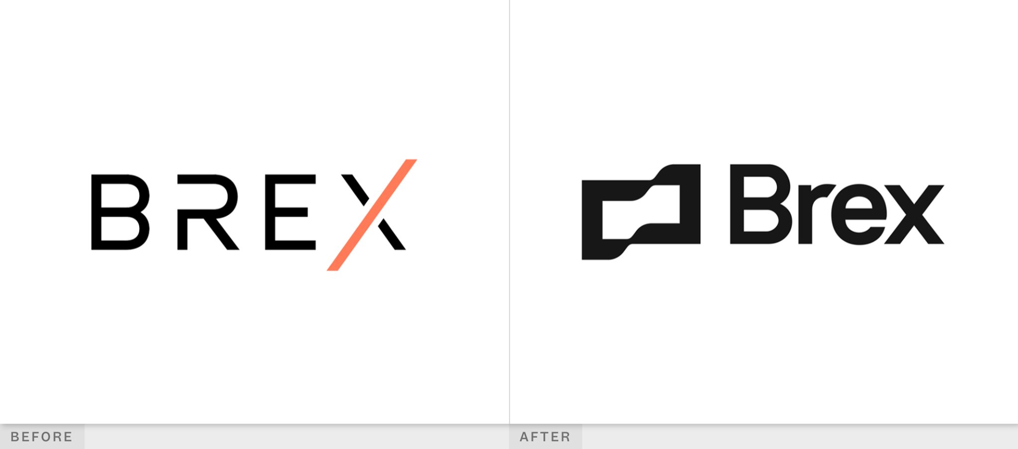
The problem
If you're asking a CFO at a 1,000-person company to move their entire treasury over to you, "ambitious fintech startup" is not reaaally the impression you want to make. The brand was creating a credibility deficit that the sales team had to overcome before the actual pitch even began.
What changed
Brex worked with Studio Freight — an agency that had been embedded with them for three years and had seen the brand's limitations first-hand. The problems were structural: colours applied inconsistently, gradients added to patch over issues, shape language interpreted differently across the business.
The direction that emerged from the process was anchored by a phrase that came up organically in early conversations: "seriously optimistic." Not a tagline — a decision-making filter. As Studio Freight's Torres put it: "Brex isn't a playful brand — they're dealing with money, and money isn't a joke — but they also didn't want it to feel humourless or stiff." That phrase became the brief.
Practically: the orange was refined from something that, in Torres's words, "could feel like Halloween" when paired with black, to a single consistent orange with defined ratios. Typography leaned into the rounded alternates in Inter, echoing the curve in the logo — continuity without making a big fuss of it. The flag icon stayed, but felt more settled. The messaging shifted away from credit limits and toward the language of empowering teams.
The upshot
If your product has moved upmarket but your brand still looks like a launch-week experiment, your sales team is doing extra work that isn't theirs to do. You can grow into enterprise without becoming boring about it.
Brex needed to feel more credible. Gusto had the opposite problem — they already felt credible to their existing customers, but the brand wasn't carrying the weight of what the product actually did…
3.
Gusto rebranded because warmth alone wasn't earning trust
Gusto handles payroll, health insurance, 401ks. For a while, you wouldn't have guessed that from their brand. It was warm, friendly, colourful — and not really communicating that the company was a safe pair of hands for something people's livelihoods depended on.
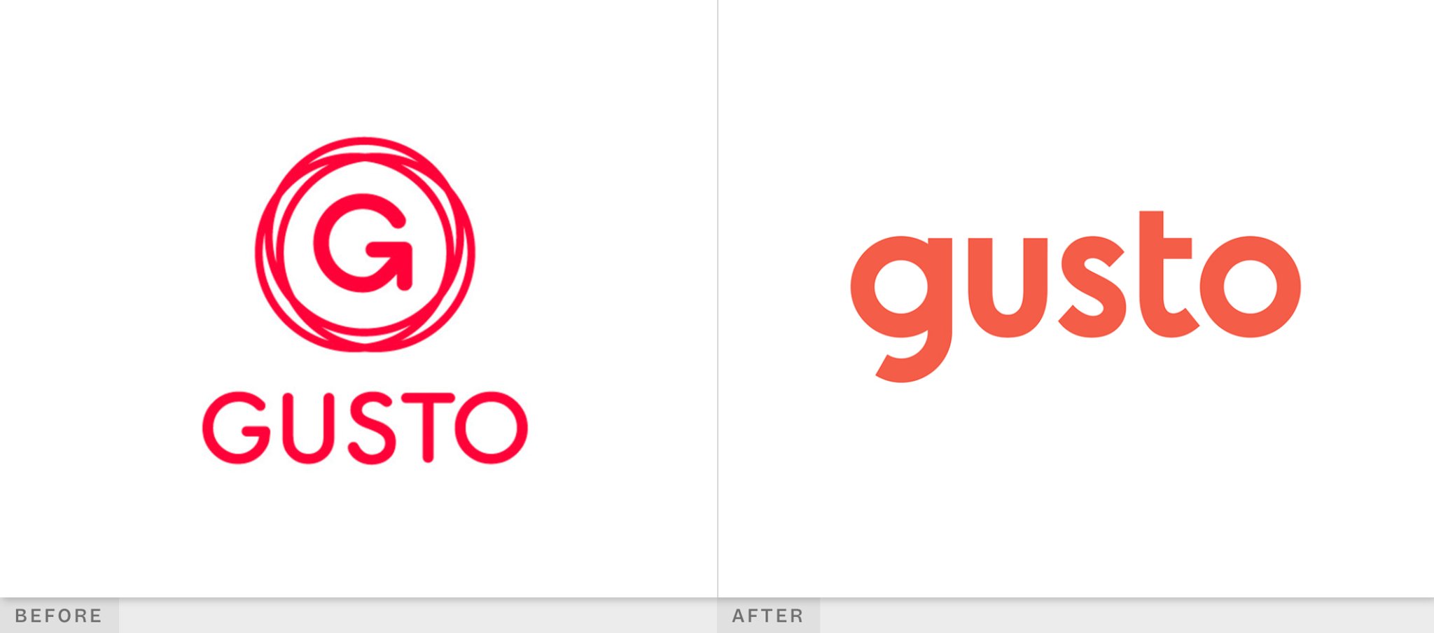
The problem
Beyond the tone mismatch, Gusto had a big consistency problem. The brand showed up differently on the web, in the product, on social, in campaigns, in physical spaces. One of the designers, Jenna Carando, put it plainly: "People's livelihoods and small businesses depended on Gusto, and we weren't showing that we were a reliable partner."
What changed
They didn't want to start over, they'd built a brand people truly liked, the goal was to evolve it. They did the foundational work properly: external interviews with employees and customers before anyone opened a design file. The positioning they landed on was: "A balance between warmth and sophistication. Warmth is how we show people we care; sophistication is how we earn people's trust."
The line they arrived at to describe the company was: "We serve remarkable humans. We have to be remarkably human too." That became the brief everything else followed from.
The colour palette moved from bright and candy-like to something more muted and earthy — more editorial, less app store. Illustration went hand-drawn, the kind of thing you'd see in a magazine. Photography became people-first. The wordmark was refined to feel more considered.
The upshot
"Professional" doesn't have to mean cold. If your brand feels too casual for the customers you want, you probably don't need to strip out the warmth. You just need to give it some backbone.
Gusto's rebrand was careful and considered — years in the making. Kit's is interesting for the opposite reason: it's a rebrand that almost went badly wrong before it went right…
4.
Kit rebranded — in public, on purpose, after a very failed attempt
This wasn't ConvertKit's first rodeo. They'd already tried a name change once, it went badly, and they reversed course. What they eventually landed on was Kit. And this time, they did it differently.
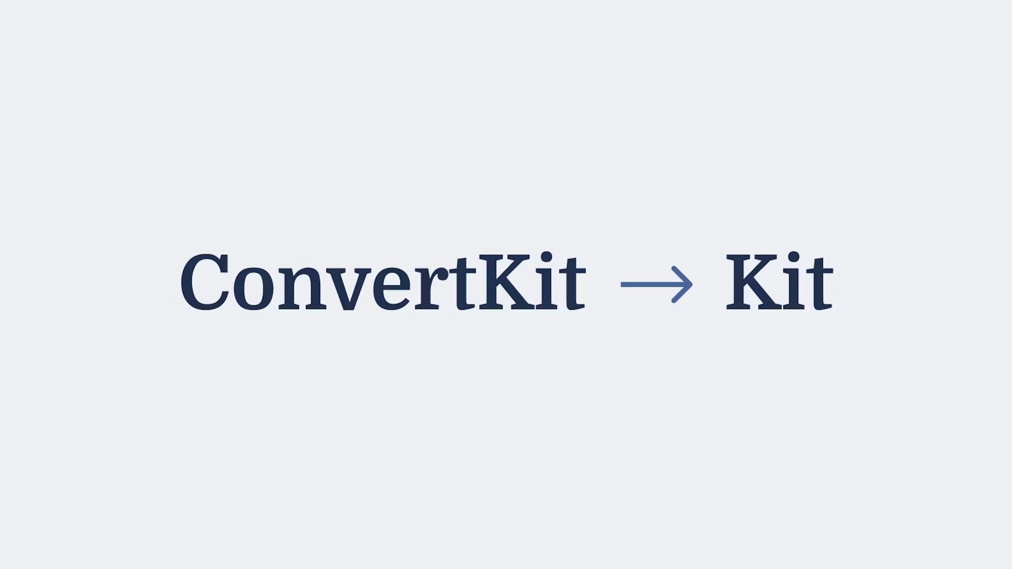
The problem
The name ConvertKit had made sense in 2013, when the company launched. It was functional, descriptive, clear. It was also long, technical, and, eleven years later, tied to an idea of "converting" people that didn't reflect what the product had become. Creators were trying to hand someone their business card and explain the name at the same time. That's not a great sign.
The broader context matters too. When ConvertKit launched, the "creator economy" wasn't really a thing yet — or if it was, people said it with air quotes. By 2024, 29% of American high school students listed "creator" as their preferred career. The market had changed completely, and a name that sounded like marketing automation was increasingly out of step with it.
What changed
The Seva detour is worth understanding, because it shaped how Kit eventually got done. Founder Nathan Barry spent two years hunting for a new name before landing on Seva — a Sanskrit word meaning "selfless service." He negotiated the domain down from $500,000 to $310,000, announced the rebrand at their annual conference, and watched the reaction turn within days. Members of the Sikh community reached out to say seva wasn't just a synonym for service — it was a sacred religious practice. Less than 30 days after the announcement, ConvertKit reversed course and went back to their original name. The $310,000 domain went with it.
When they came back to the question with Kit, they did it differently — getting on calls with creators to road-test the name before committing, rather than announcing and hoping for the best. "Kit" worked because it captured something true about the product: a set of tools to help you build something. One syllable, easy to say on a podcast, easy to spell when someone hears it for the first time. The visual identity followed — cleaner, more confident, less "email marketing software circa 2013."
The upshot
Kit's rebrand earns its place here because it's honest about failure in a way most case studies aren't. The $310,000 domain they used for 30 days is probably the most expensive naming lesson we've come across — but it did produce a much better second attempt.
Kit's name change was years in the making. But Lovable's happened fast — because it had to…
5.
Lovable rebranded from a name nobody could explain to one that sells itself
In late 2024, a company called GPT Engineer rebranded as Lovable. GPT Engineer is a great name for an open source GitHub project. It is a terrible name for something you want people to fall in love with.
The problem
GPT Engineer started as an open source project in 2023. The name made sense for that context — descriptive, technical, clear about what it was. The project went viral, racked up 52,000 GitHub stars, and built a 27,000-person waitlist. Investors noticed. The company raised $7.5M in pre-seed funding in October 2024.
At that point, GPT Engineer wasn't really a GitHub project anymore. It was becoming a consumer product — a tool people were supposed to fall in love with and recommend to friends. "GPT Engineer" doesn't do that job. It describes the mechanism, not the experience.
What changed
The rebrand was done by Primary, who described the brief as needing a brand that "felt as alive as the platform itself." The new name, Lovable, does something the old one couldn't: it tells you how using the product is supposed to feel, and it's easy to say, easy to remember, and easy to repeat.
The full identity, name, visual system, product updates, launched in December 2024.
The upshot
The numbers after the rebrand are worth including, with the caveat that a lot was going on at once: $17M ARR, 30k+ paying customers, 1.2M apps built, a further $15M raised in February 2025, and $330M in a Series B since. Brand wasn't the only thing driving that, the product timing was exceptional, but a name that made people want to talk about it certainly didn't hurt.
Lovable needed a name that could travel — one that worked for someone discovering the product on social, not just a developer browsing GitHub. Wise had a different kind of scale problem: a brand that needed to work in every market on earth…
6.
Wise rebranded to look like a company going everywhere, not just somewhere
Wise's rebrand in March 2023 was the third significant identity shift in about two years. They'd changed their name from TransferWise to Wise in 2021, then spent the following years figuring out how to make the visual identity catch up with what the company was actually becoming.
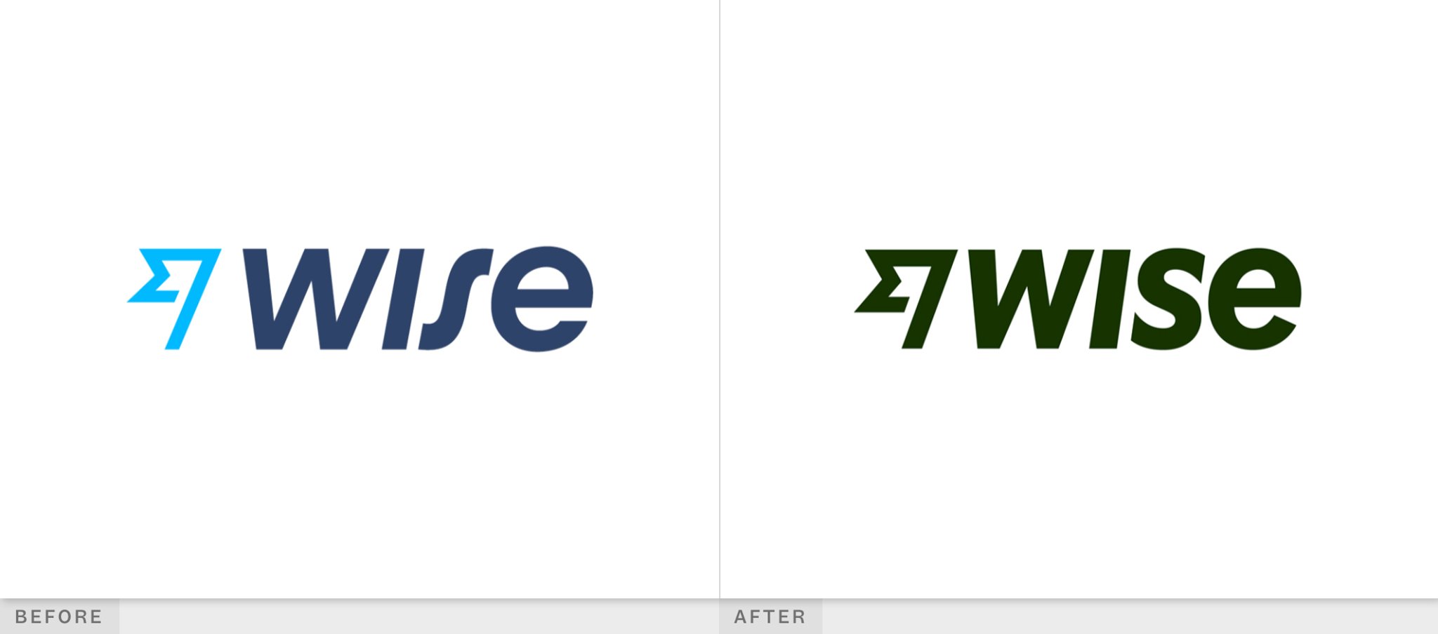
The problem
TransferWise had launched as a service that helped people send money internationally without getting ripped off by banks. That was a clear, specific, valuable thing. "Wise" was broader — a name that could carry the idea of a full international account, not just a transfer tool. But the brand still looked like a money-transfer service: safe, cautious, blue.
The strategic shift was from "send money internationally" to "the world's most international account." That's a meaningful expansion of scope, and it needed a brand that could carry it.
What changed
The most visible change was colour — from a conservative blue to a bold citrus green. Not a neutral, safe-in-any-market green, but an assertive one. The move was deliberate: Wise needed to feel exciting and distinctly itself in markets around the world, not just trustworthy. New universal symbols were developed to work across languages and contexts. The typography was updated. And, as Wise put it in their own announcement, they "rediscovered their voice."
The upshot
Wise's rebrand is a good example of a brand that needed to grow geographically, not just in terms of product. The green works because it's confident enough to be recognisable anywhere. When you're building for everywhere, looking like you belong somewhere specific becomes a liability.
What the best B2B rebrands have in common
The thing that stands out across all six of these top tech company rebranding success stories is that none of them started with design. Instead, they started with a clear-eyed look at what had actually changed in the business, and what the brand needed to do differently as a result.
Most rebrands we see go wrong do so because the brief is too vague, the stakeholders aren't aligned on what problem they're solving, or someone rushed into visual decisions before the strategic ones were settled. You end up with something that looks good in the presentation and doesn't work in the real world.
The other thing worth noting: almost every brand in this list made meaningful changes to their messaging and voice, not just their visual identity. That's the part that rarely gets written about in rebrand case studies — everyone focuses on the logo, the colours, the "before and after." But how Brex started talking about empowering teams instead of credit limits, or how Gusto's illustration style started communicating trustworthiness that the copy alone couldn't carry — that's where a lot of the real work happened.
Brand on the brain but not sure where to start?
We've got a workshop for that. Check out our get started page to learn more about the brand clarity sprint.